Redesigning the returns experience to reduce support load and empower customers.
Birdsnest: Improving Returns to Support a Customer‑First Approach
At a glance
- assignmentProject
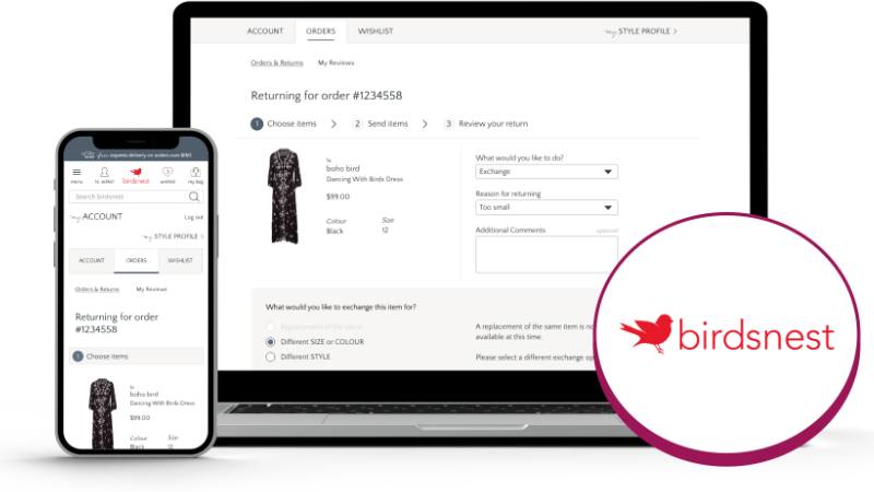
Birdsnest Online Return Process
- person_editRole
UX Designer
- calendar_clockTimeline
2017–18
- design_servicesTools
Adobe XD, stakeholder interviews, competitor benchmarking
- groupUsers
Online fashion shoppers, Birdsnest Returns and Customer Service teams
- approval_delegationResponsibilities
UX research, wireframing, prototyping, cross-functional collaboration, process optimisation
Project highlights
A focused redesign of Birdsnest’s mobile navigation, anchored in real user feedback and executed with care.
Returns flow redesign
Simplified and clarified the online return process for customers.
Customer-led improvements
Added key exchange options and guidance based on common customer frustrations.
Conditional form logic
Reduced friction with dynamic form fields tailored to user responses.
Support team collaboration
Partnered closely with Customer Service and Returns staff to uncover real pain points and test solutions.
Operational efficiency
Reduced manual follow-ups and incomplete returns during high-volume shopping periods.
Prototyping for feedback
Used interactive wireframes to align early with internal teams and iterate quickly.
Project Summary
Birdsnest is known for its loyal customer base and standout service. I was brought in to redesign the online return and exchange flow, aiming to support both customers and the internal teams handling returns. The original form lacked clarity and made exchanges cumbersome, often requiring follow-up from staff.
The goal: streamline the experience to be clearer, faster, and easier for everyone involved—while staying true to the brand’s reputation for personalised care.
The challenge
Customers wanting to exchange an item couldn’t specify what they wanted in return—leading to gaps in information, confusion, and extra manual work for staff. During peak periods, this meant overwhelmed inboxes and processing delays.
Common issues included:
- Customers required to contact customer service to initiate an exchange
- Incomplete forms that slowed down processing
- Staff feeling reactive rather than proactive
The opportunity was to streamline the form and return flow, giving customers the information and tools they needed upfront, while easing the pressure on internal teams.
Research & Insights
We gathered insights through a full customer survey, heatmaps, and analytics. Common issues included poor page performance, unclear navigation, and an inability to find key features.
We analysed user behaviour to identify top-visited pages and most-used categories, and conducted internal interviews to gather feedback from staff and customer-facing teams. This gave us a clearer picture of friction points and where we were falling short in supporting customer goals on mobile devices.
Approach & Process
To design something truly useful, I started by mapping the current process and interviewing Returns and Customer Service staff. Their feedback shaped the approach, which focused on:
- Adding the ability to nominate exchange items directly in the form
- Using conditional logic to keep the flow simple and conversational
- Providing inline guidance and clearer options throughout
I prototyped the new flow in Adobe XD, starting with simple wireframes and gradually layering in full UI elements and interaction logic. This let us test early and refine quickly based on internal feedback. The design team worked closely with staff to ensure both usability and backend manageability.
Outlook & Impact
While formal metrics weren’t recorded post-launch, the results were clear:
- Significant reduction in incomplete or unclear return requests
- Less manual follow-up required by Returns staff
- Improved processing time during high-traffic shopping periods
- Positive feedback from both customers and internal teams
The updated process was more intuitive for users and easier for staff to manage—making it a win for both sides.
Reflections
This project showed how even a small piece of the experience—like a form—can have a wide-reaching impact when designed with care. By working closely with internal teams, I was able to design something that didn’t just look good, but functioned well across the entire business.
It also deepened my appreciation for prototyping as a collaborative tool. Even low-fidelity wireframes can unlock quick feedback and faster alignment when used at the right time.