Redesigning the mobile shopping experience for a fashion-forward, customer-first brand.
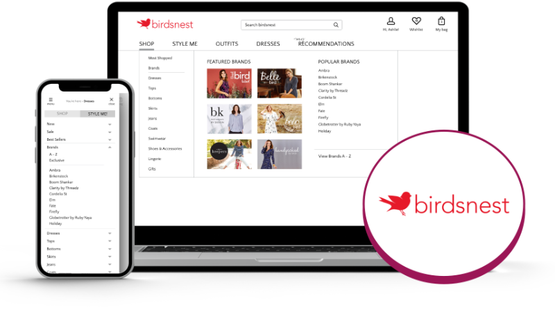
Birdsnest: Crafting a Seamless Navigation Experience
At a glance
- assignmentProject
Birdsnest Mobile-First Navigation Redesign
- person_editRole
UX/UI Designer
- calendar_clockTimeline
2021
- design_servicesTools
UXPin, Adobe XD, Hotjar, Google Analytics
- groupUsers
Mobile shoppers, fashion-focused customers, returning Birdsnest customers
- approval_delegationResponsibilities
Mobile UX audit, navigation redesign, prototyping, internal testing, stakeholder collaboration
Project highlights
A focused redesign of Birdsnest’s mobile navigation, anchored in real user feedback and executed with care.
Mobile-first navigation upgrade
Reimagined site navigation with a mobile-first approach, improving clarity, accessibility, and feature visibility across all screen sizes.
User-informed design
Led a customer-wide survey and behaviour analysis to uncover frustrations and inform design priorities.
Smarter site structure
Rebuilt both mobile and desktop menus with a clearer hierarchy and intuitive content grouping to support product discovery.
Conversion boost
Delivered a 21% lift in mobile conversion after launch, validating the impact of improved usability and navigation flow.
Wishlist reinstated
Brought the Wishlist feature into view on mobile and tablet, resulting in renewed engagement and customer delight.
Team-aligned outcomes
Collaborated closely with internal teams to validate the new structure and ensure alignment with brand and operational needs.
Project Summary
Birdsnest is known for its loyal customer base and personalised approach to online shopping. As mobile traffic grew, it became clear the site’s mobile navigation was falling short—both visually and functionally. I was brought in to reimagine how customers explored the site on smaller screens, with a focus on clarity, conversion, and brand alignment.
The goal was simple: help people find what they’re looking for quickly and intuitively, while creating a mobile experience that felt as polished and supportive as the desktop version. By uncovering user frustrations and responding with practical, thoughtful design, the project delivered real business and customer impact.
The challenge
Despite a strong brand and loyal following, Birdsnest’s mobile site was underperforming. The main issues included:
- Cluttered layout and confusing navigation hierarchy
- Inaccessible or missing features—like the Wishlist—on mobile
- Slow load times, causing user frustration and dropped sessions
We conducted a large-scale customer survey and paired that with analytics and heatmaps. The verdict was clear: mobile shoppers were struggling, and it was costing conversions. Internally, the team knew this was a missed opportunity—especially as mobile traffic had overtaken desktop.
The challenge was not only to fix these usability issues, but to do so in a way that felt consistent with the brand’s tone: clear, personal, and customer-first.
Research & Insights
We gathered insights through a full customer survey, heatmaps, and analytics. Common issues included poor page performance, unclear navigation, and an inability to find key features.
We analysed user behaviour to identify top-visited pages and most-used categories, and conducted internal interviews to gather feedback from staff and customer-facing teams. This gave us a clearer picture of friction points and where we were falling short in supporting customer goals on mobile devices.
Approach & Process
To design an experience that worked, I started by mapping the existing navigation structure and identifying friction points.
Key steps included:
- Reviewing heatmaps and customer survey data to prioritise fixes
- Auditing the existing menu and filter structure for accessibility and logic
- Designing a simplified, mobile-first navigation hierarchy that surfaced top categories and pathways
- Reintroducing key features (like the Wishlist) with persistent visibility across devices
- Creating interactive prototypes and testing with internal teams for validation
- Collaborating with developers to ensure design fidelity and performance on mobile
Tools used: UXPin (initial wireframes), Adobe XD (prototyping), Google Analytics & Hotjar (insights).
Outlook & Impact
The redesign led to measurable improvements:
- 21% increase in mobile conversion rate
- Clearer navigation pathways reduced user frustration and drop-offs
- Fewer support tickets and customer complaints about usability
- Users discovered previously hidden features like the Wishlist, which boosted engagement and satisfaction
One customer even wrote in to say she “finally found the Wishlist” on her phone—something that had previously gone unnoticed. For the business, this redesign unlocked a major growth lever: helping customers do what they came to do, faster and more easily.
Reflections
This project reminded me how powerful it is to listen closely—to customers, to data, and to the everyday moments that make or break an experience. The Wishlist feature wasn’t new, it just wasn’t findable. Sometimes, great UX is less about invention and more about visibility.
It also reinforced that mobile-first isn’t just about responsive layouts—it’s about actual usability. Every tap, every scroll, every moment matters. Since then, I’ve carried this mindset into every mobile project: simplify, humanise, and support the path forward.